

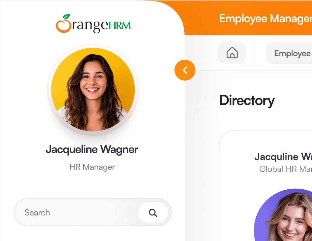
OrangeHRM
Duration
5+ years · Full-time.
Role
Team Lead · UX.
Domain
Human Resource Management
Context
Enterprise HR platform used by organisations globally

Overview
OrangeHRM is a global enterprise HRM platform used by organisations across the United States and South American regions, supporting complex workforce management needs at scale.
As a Team Lead · UX, I spent over 5 years working on the platform, owning the end-to-end user experience across core HR modules. My role extended beyond interface design—I led UX strategy, established foundational design standards, and guided the product’s visual and interaction direction as it evolved into a data-dense, enterprise-grade system.
Working closely with product leadership, engineering, QA, marketing, and mobile teams, I helped modernize a legacy HR platform while it remained actively used by global clients. The focus was on improving usability, scalability, and clarity for both everyday HR users and power administrators operating within complex organisational environments.


Responsibilities
As UX Team Lead at OrangeHRM, I owned the end-to-end user interface and experience across core HRM modules. I led the design team, maintained and evolved the Orange Experience Design (OXD) system, and worked closely with product leadership, engineering, QA, marketing, and mobile teams to ensure consistency, scalability, and delivery quality across the platform.
Key Problems
Identified.
Outdated UI Framework
The interface was built on an older version of Material Design, originally suited for lightweight, mobile-first use.As the product evolved into a data-dense, desktop-focused enterprise system, the UI no longer supported complex workflows or prolonged usage.
No Differentiation Between User Types
All users—light users, administrators, and power users—were presented with the same interface.This increased friction for experienced users while overwhelming less frequent users with unnecessary complexity.
Fragmented and Inconsistent UX Flows
User flows had evolved organically without a consistent interaction model across modules. Similar tasks behaved differently, increasing cognitive load and reducing overall usability.
Highly Nested and Frictional Navigation
Navigation was deeply nested and fragmented throughout the product. Key actions were difficult to discover, leading to inefficient workflows and reliance on support.
Lack of UX Foundations and Organisational Maturity
There was no dedicated UX function, design system, or documented guidelines in place. UX literacy across the organisation was low, requiring foundational standards to be established while the product remained live.


Research & Approach
I began by building a strong understanding of the HRM domain, including core workflows, terminology, user roles, and compliance considerations. This helped ground design decisions in real operational needs rather than surface-level UI changes.
To understand different usage patterns, I analysed light users, power users, and administrators, identifying variations in goals, frequency of use, and information requirements. This informed decisions around interaction complexity, information density, and workflow structure.
I conducted competitive and comparative analysis in collaboration with business analysts and consulting partners to identify industry patterns, gaps, and opportunities to modernise the product while meeting enterprise expectations.
Throughout the process, I gathered feedback from product stakeholders, the PS team, and QA, helping surface key pain points, information architecture issues, and quality considerations.
All design decisions were balanced against business goals and technical constraints, ensuring solutions were feasible, scalable, and suitable for a live enterprise system.
Process & Design Strategy
To address OrangeHRM’s UX challenges at scale, the solution strategy focused on modernising the product incrementally, while keeping the system stable for a large, active user base. All work was carried out using an Agile delivery model, coordinating closely with product, engineering, QA, and stakeholders.
With 500+ active pages across the platform, a full redesign was not feasible in a single release. Instead, the UX transformation followed a structured three-level rollout that allowed continuous improvement while the product remained live.

Transformation Phased & UIUX Strategy
1
Module-Level Upgrades (Feature-Driven)
The redesign began with modules receiving active upgrades or new features. This allowed UX improvements to be introduced naturally alongside development work, ensuring immediate value while aligning with ongoing product roadmaps.
2
Low-Friction and Low-Usage Screens
Next, less frequently used or lower-risk screens were redesigned. These areas served as validation spaces to test updated interaction patterns, visual hierarchy, and usability improvements before wider rollout across high-impact workflows.
3
Component-Level Modernisation via OXD
At the foundation level, UI components were progressively rebuilt using the newly established OXD This ensured consistency across modules, reduced design and development fragmentation, and enabled faster, more reliable iteration.
Navigation as a Dedicated UX Initiative
Navigation was treated as a separate, strategic project, recognising it as the backbone of the product experience. Information architecture was re-evaluated independently to reduce deep nesting, improve discoverability, and support both everyday and power-user workflows across the system.
Establishing OXD as a Scalable Foundation
The OXD design system unified UI components, patterns, and interaction standards across OrangeHRM. Beyond visual consistency, it improved accessibility, streamlined QA validation, aligned cross-functional teams, and created a shared UX language across design, engineering, marketing, and mobile teams.
Enterprise-Focused UI Modernisation
The interface was modernised to better support data-dense, desktop-first enterprise usage, prioritising clarity, hierarchy, and long-session usability over mobile-first visual patterns. This ensured the system scaled effectively with product complexity and user needs.


Key Design Solutions
Based on the identified problems and overall design strategy, several key UX and UI solutions were implemented to improve usability, scalability, and long-term maintainability across OrangeHRM.
Navigation & Information Architecture
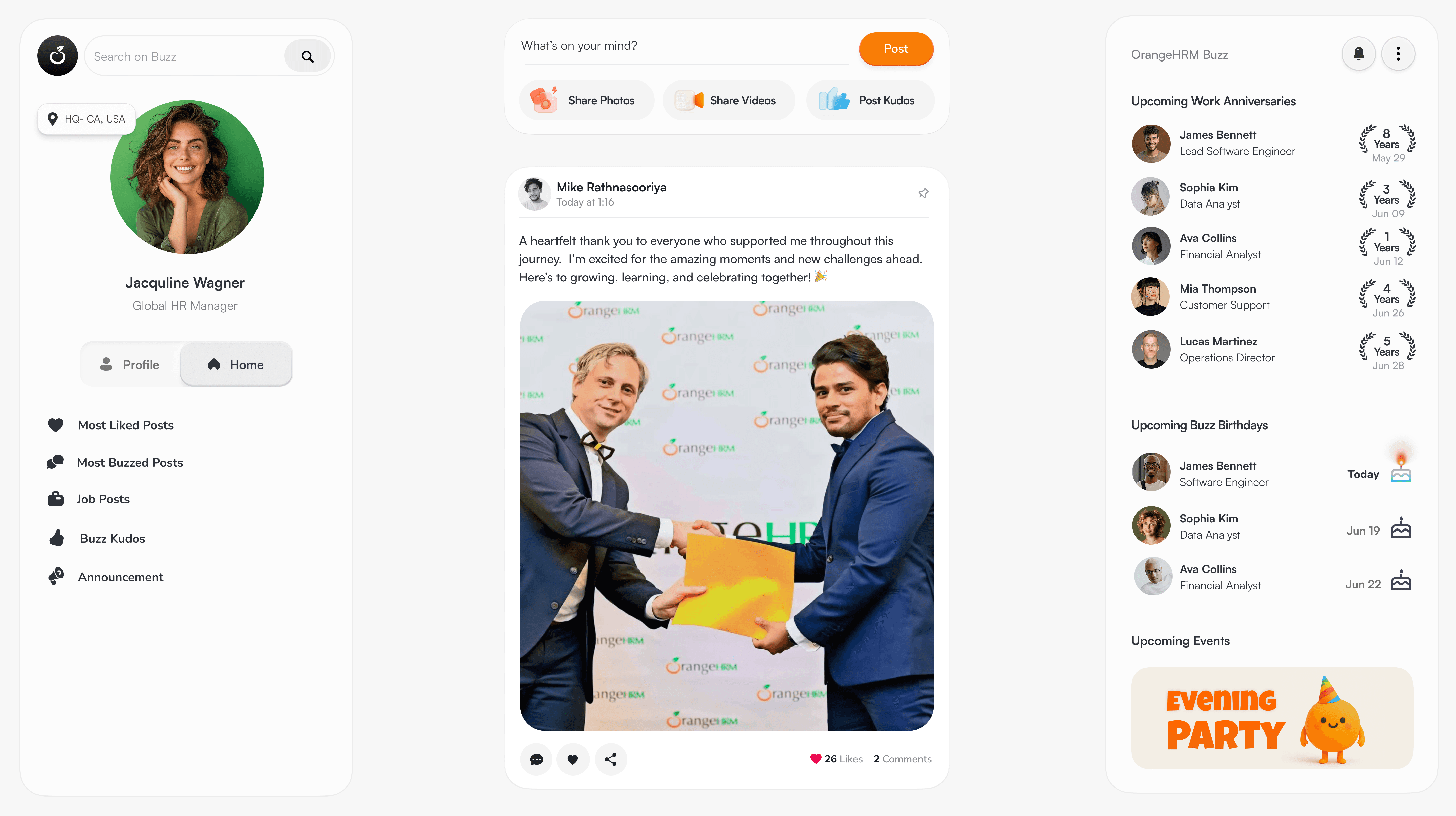
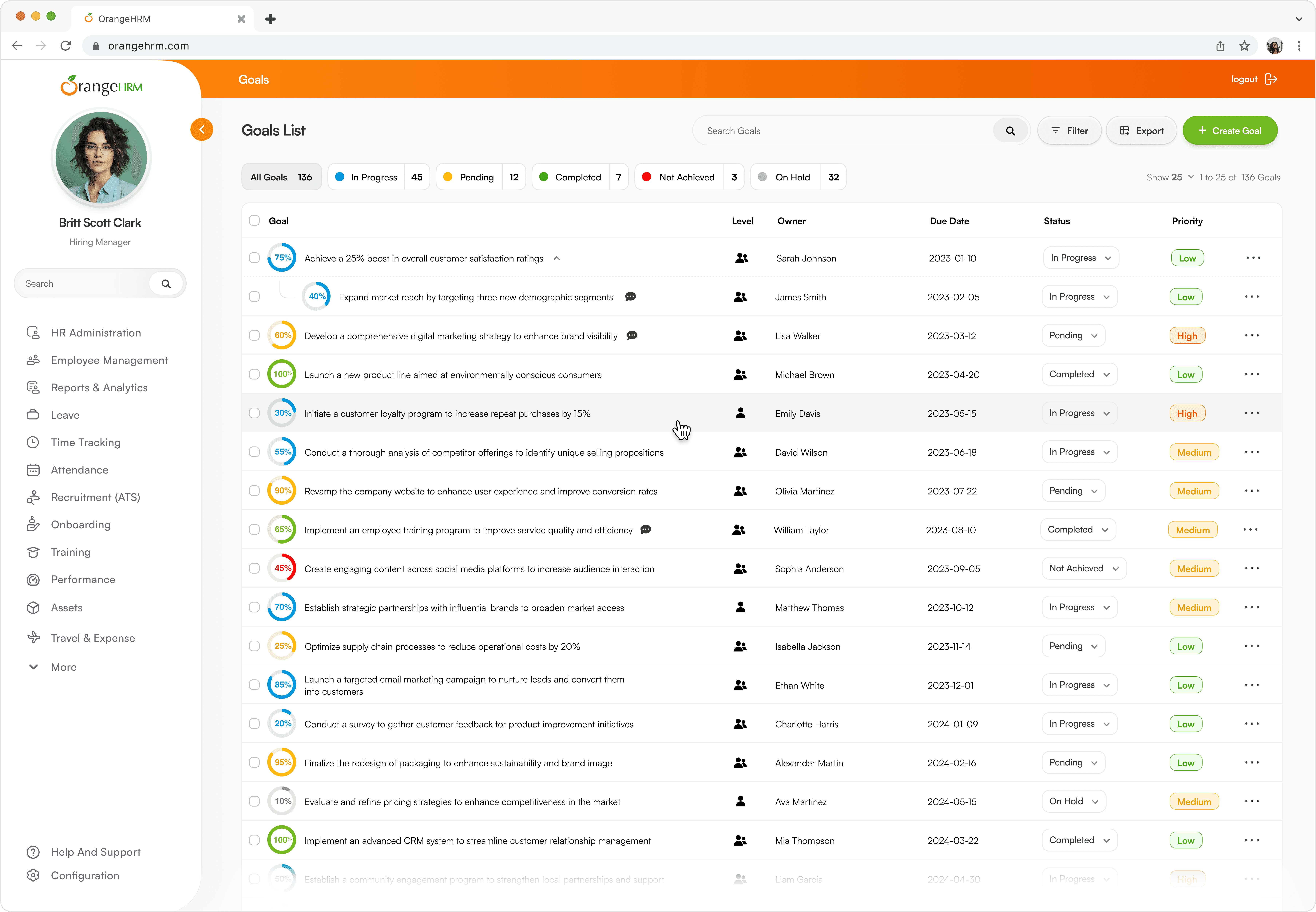
Redesigned navigation to reduce deep nesting and improve discoverability. Introduced Quick Add, Smart Search, and clearer task grouping for faster access.
Module-Based Dynamic Interface
Applied module-aware UI patterns that adapt to context and usage depth. Interfaces remain dynamic yet cohesive, balancing flexibility with system-wide consistency.
Standardised UX Flows Across Modules
Unified core interaction patterns across modules and workflows. Predictable layouts reduced cognitive load and improved learnability.
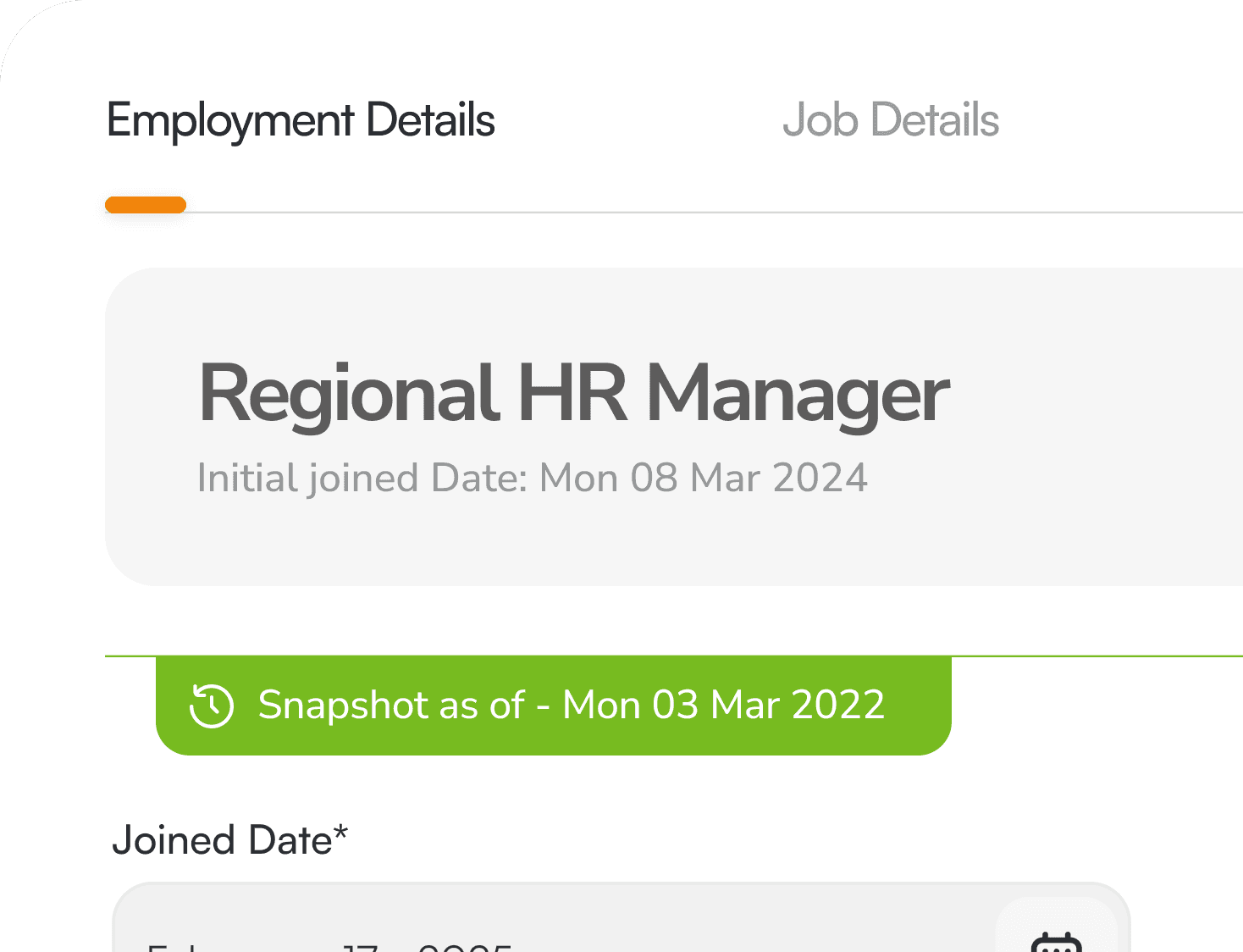
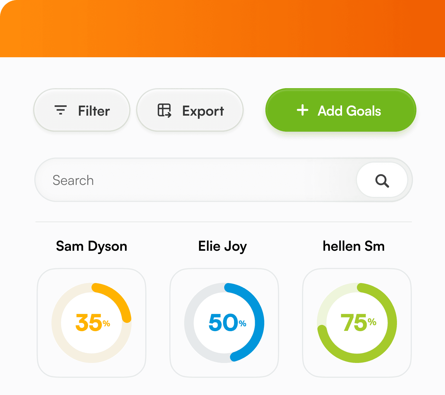
Data-Dense UI Optimisation (OMI Model)
Optimised tables and forms for enterprise-scale data handling. Added cluster loading, preloading states, and motion cues to improve perceived performance.


OXD Design System Introduction
Standardised components, patterns, and interaction rules via OXD. Improved consistency, delivery speed, and design–engineering–QA alignment.
Progressive Disclosure & Contextual Actions
Reduced interface complexity by revealing actions only when relevant. Contextual controls improved focus, efficiency, and decision-making in dense workflows.

Orange Experience Design (OXD)
OXD is the shared design system that underpins OrangeHRM’s user experience.
It standardises components, interaction patterns, motion, and feedback across modules, ensuring a cohesive, scalable interface for complex enterprise workflows.
By aligning design, engineering, QA, and product teams around a single system, OXD reduced fragmentation, improved delivery consistency, and provided a sustainable foundation for ongoing product evolution.
